
TikTok Dashboard
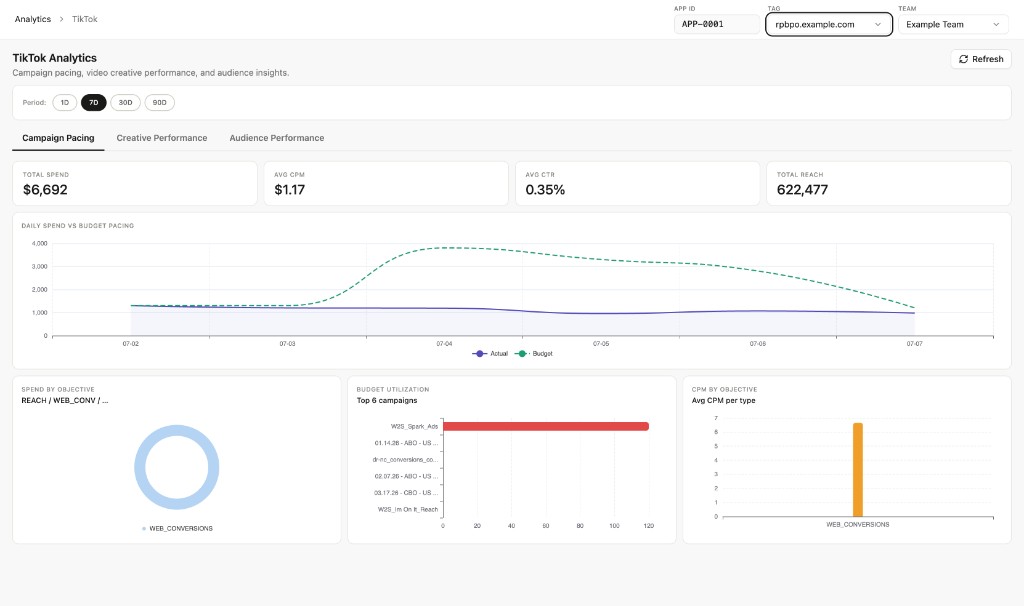
Open Analytics → TikTok in the Blotout Cloud web app. The dashboard covers campaign pacing, video creative performance, and audience insights.
Summary KPIs for the selected period: total spend, average CPM, average CTR, and total reach.
Daily Spend vs Budget Pacing — Line chart comparing actual spend (solid) against budget pacing (dashed) day over day. Use this to spot underspend or overspend relative to plan.
Spend by Objective — Donut chart showing how spend is distributed across campaign objectives (for example, web conversions).
Budget Utilization (Top 6 campaigns) — Horizontal bar chart ranking campaigns by how much of their allocated budget has been used.
CPM by Objective — Average cost per mille grouped by objective type.
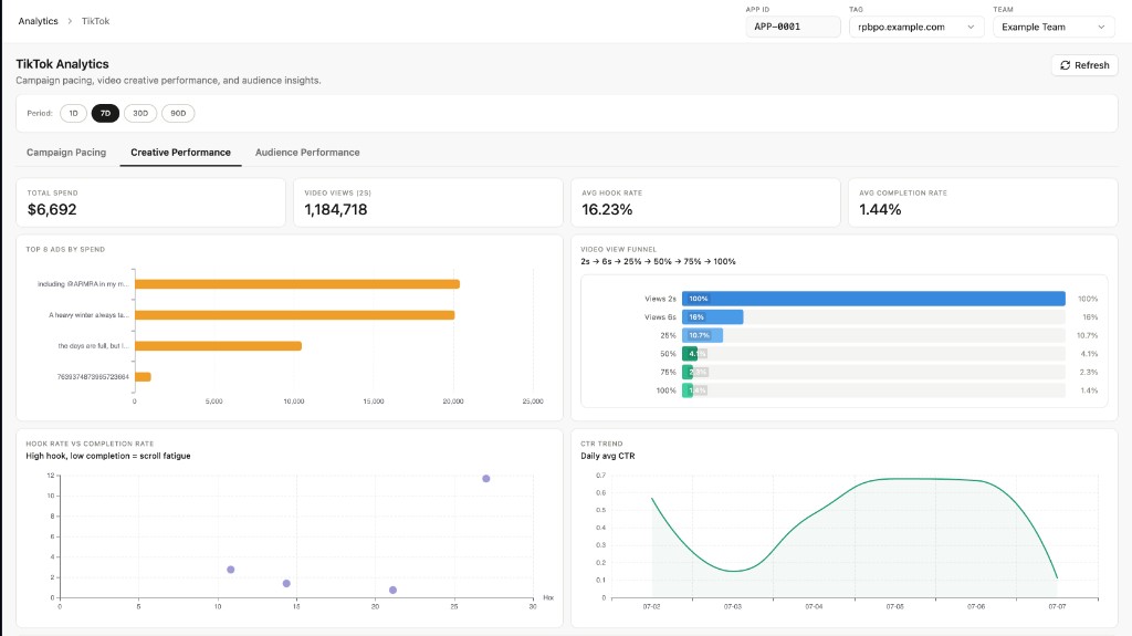
Summary KPIs: total spend, video views (2s), average hook rate, and average completion rate.
Top 8 Ads by Spend — Horizontal bar chart of the highest-spend ad creatives.
Video View Funnel — Drop-off from 2s views through 6s, 25%, 50%, 75%, and 100% completion to see where viewers disengage.
Hook Rate vs Completion Rate — Scatter plot of ads by hook rate and completion rate. Ads with high hook but low completion may indicate scroll fatigue.
CTR Trend — Daily average click-through rate over the selected window.
CPV (2s) by Ad — Cost per 2-second view for the top 8 ads by spend.

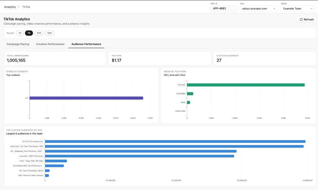
Summary KPIs: total impressions, average CPM, and number of custom audiences in use.
Spend by Country — Horizontal bar chart of spend across top markets.
Spend by Platform — Breakdown across iPhone, Android, iPad, and unknown devices.
Top Custom Audiences by Size — Largest custom audiences in the team, ranked by audience size.
Data refresh
Section titled “Data refresh”Data is populated after the TikTok Ads ELT pipeline syncs and the tiktok_dashboards Airflow DAG completes its dbt run. See Data Pipelines to connect a TikTok source.