
Facebook Dashboard
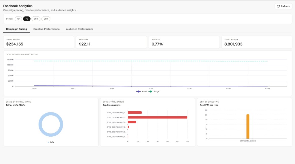
Open Analytics → Facebook in the Blotout Cloud web app. The dashboard covers campaign pacing, creative performance, and audience insights.
Summary KPIs for the selected period: total spend, average CPM, average CTR, and total reach.
Daily Spend vs Budget Pacing — Line chart comparing actual spend (solid) against budget pacing (dashed) day over day. Use this to spot underspend or overspend relative to plan.
Spend by Funnel Stage — Donut chart showing spend distribution across ToFu, MoFu, and BoFu funnel stages.
Budget Utilization (Top 6 campaigns) — Horizontal bar chart ranking campaigns by how much of their allocated budget has been used.
CPM by Objective — Average cost per mille grouped by objective type (for example, outcome sales).
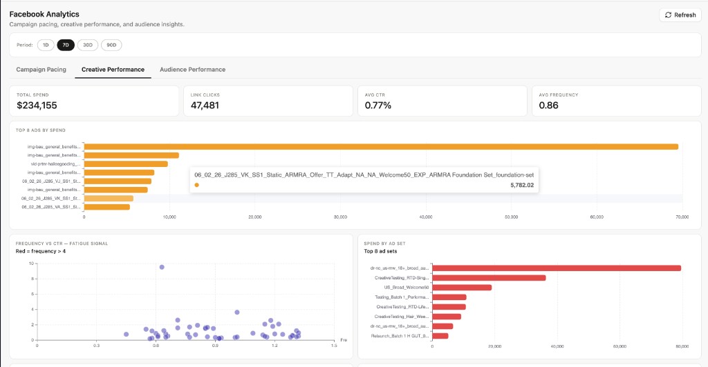
Summary KPIs: total spend, link clicks, average CTR, and average frequency.
Top 8 Ads by Spend — Horizontal bar chart of the highest-spend ad creatives.
Frequency vs CTR — Fatigue Signal — Scatter plot of ads by frequency and CTR. Points with frequency above 4 are highlighted in red to flag creative fatigue.
Spend by Ad Set — Top 8 ad sets ranked by spend.
CTR Trend — Daily average CTR over the selected window.
CPC vs Link CTR — Scatter plot comparing cost per click against link CTR to identify efficient and inefficient ads.

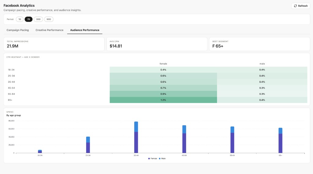
Summary KPIs: total impressions, average CPM, and best-performing segment.
CTR Heatmap — Age × Gender — Table showing click-through rate by age group and gender. Darker cells indicate higher CTR.
Spend by Age Group — Stacked bar chart of spend split by female and male across age brackets.
Data refresh
Section titled “Data refresh”Data is populated after the Facebook Marketing ELT pipeline syncs and the facebook_dashboards Airflow DAG completes its dbt run. See Data Pipelines to connect a Facebook source.